Design For America
Creating an EMR application to improve medical accessibility in Tijuana, Mexico
Overview
International Health Collective (IHC) is a student-run organization that strives to tackle large issues related to health in the San Diego–Tijuana region. On the first Saturday of every month, IHC and medical professionals host a pop up clinic in Tijuana to serve local families. However, the clinic uses traditional tools often causing a backlog of files, long wait time for patients, security risks, and more.
As part of a Design for America (DFA) project and to speed up the flow of the clinic, we designed an EMR application to help medical professionals document patient information digitally on a tablet, reducing wait time, improving security of personal information, and reducing risk of losing patient files.
User Research
To understand the journey of a patient and how the clinic operated, we interviewed five volunteers at the medical center and also performed user testing with the current EMR application that was under beta. We took notes along the way, screen and voice recorded each interview, and built user personas to better understand our use cases.
The interview notes and recordings can be found here and the findings are described below.
The Clinic flow
A good amount of our time was spent on understanding the clinic flow with each IHC member:
Typically, a patient would sign in at the reception and wait in the waiting area.
Once a triage station is ready, the medical professionals would bring the patient and their file to the triage area. The triage station is where a patient’s vitals are assessed.
After triage, there is a relay station that would place the patient with the appropriate doctor (some specialize with pediatrics, etc.) at the SOAP diagnosis station.
Finally, if a patient needs medication, they would head to the pharmacy section of the clinic.
Visual representation of the clinic
Detailed chart representing the flow of the clinic
User Personas
With the interviews that our team had conducted, we consolidated information to understand our target audience. These two personas are both primary stakeholders, but differ immensely.
Kayleigh
A Public Health major at UC San Diego that is passionate about improving health care in developing countries. She loves community service and consistently volunteers at the pop-up clinic in Tijuana. She is a mono-lingual English speaker and faces difficulty communicating with Tijuana residents.
Antonio
A plumber working in a family-owned business in Tijuana, Mexico. He spends most of his time working to support his family and supports his wife and three kids. With his limited free time, he goes out to parks and picnics with his family but lacks proper health care due to its steep costs.
Key Insights
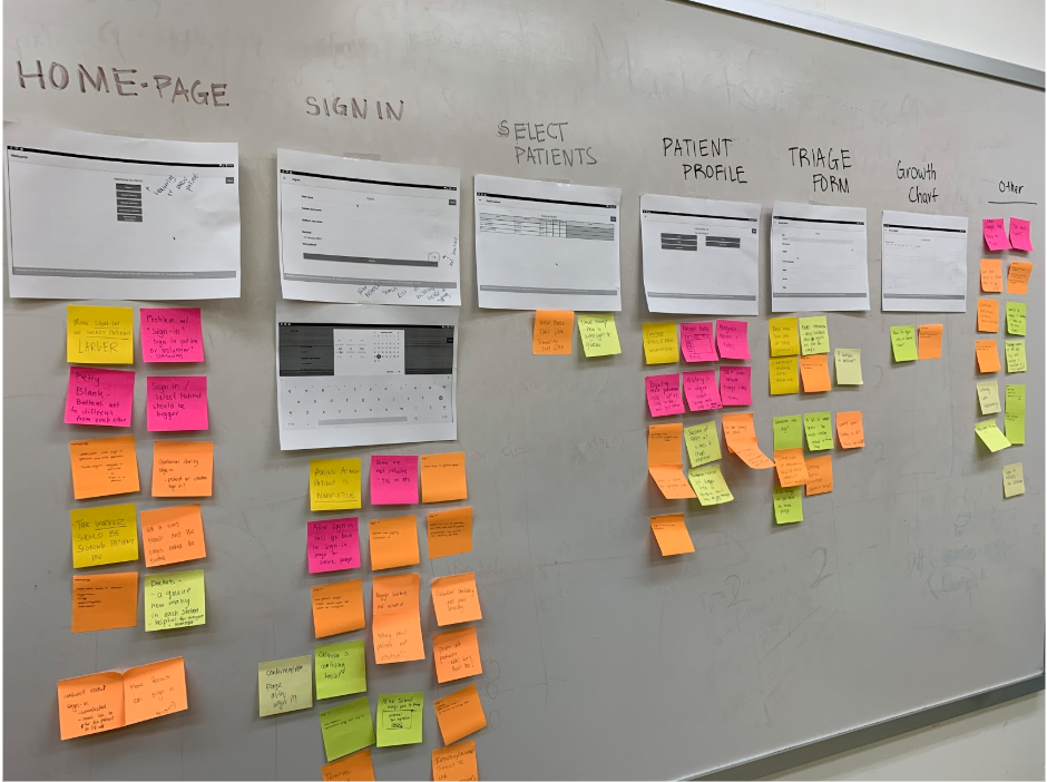
Through interviews and usability testing of the current EMR application in beta, we used the affinity process and gathered insights and identified the main pain points of the application.
Affinity mapping to help categorize our findings
Homepage
Larger Buttons: The buttons were small compared the large amount of white space on the screen.
“Sign-In”: The Sign-In button brought confusion because some users interpreted it as signing in a patient whereas some users thought of it as signing clinic staff.
Patient Profile page
History: The History button was misleading because users were confused if it was patient history or history of a specific area in the clinical process.
Triage + SOAP: From our interviews, we learned that medical professionals would like to see triage and SOAP forms togethers. A suggestion was to have access to both form on the same screen.
Triage Form
Whitespace: There was too much whitespace on the form because each field took up the whole width of the screen which was a big eye sore.
Submission of forms: There was also confusion about what the next screen should be after completing the form, whether it should lead to the homepage or the next step of the clinic flow.
Overall
Confusing interface with too many pages for the user to navigate through.
Visually unappealing design leading to reluctant returning users.
Reframing the problem
After understanding the pain points, we created How Can We questions to reframe and better understand the problem. These questions are a direct reflection of the insights we uncovered, and are questions that helped us guide towards a solution.
How can we design a flow that better manages the information system within the clinic?
How can we effectively record, store, and search through patient data?
How can we intuitively structure submission and sign-in forms and reduce frustration?
How can we display growth of a patient that efficiently tracks progress?
Ideation
Each team member performed a Crazy 8’s activity of what the application could look like to sketch as many screens as possible on the spot. One by one we shared our ideas with the team and gave each other feedback and discussed the features each screen will have. Below are some of the sketches.
A great example of a detailed version of what the patient profile might look like under the Triage tab.
This sketch highlights the importance of a log-in screen, confirmation feedback after checking in a patient, and an easy-to-use/extensive library of patient records.
My sketch that focused on feedback and validation for input in fields. It helps keep accurate numbers, and identifies any potential health risks the patient might have. It also has a visual map of the clinic that shows what areas are busy and what areas are free.
Exploring a variety of menus to enter different roles depending on who you are and how much access you have.
Low fidelity screens
Following the making of the low-fi wireframes, we went back to IHC and TESC to perform user testing. We wanted to see what flows worked, and what parts weren't as great as what they might have seemed.
After several user tests, our team moved forward with the ideas that best helped our research and tests. The final low-fi screens are below.
Style Guide
In terms of the overall visual design direction, we aimed to keep it consistent and minimal, as our target user group needs information surfaced in a way that is clear and doesn’t provide cognitive overload for the user. Our goal was for the data and information to be the main focus so we utilized white space and reduced gradients and large blocks of colors.
High fidelity Screens
Sign in page
Home page
During our research and ideation phase, we discussed different ways to organize the information architecture. In the end, we decided that the homepage should have as few options as possible and should relate to the different stations at the clinic. Furthermore, we made the buttons larger and different from one another so clinic staff members can identify which button they need to press subconsciously.
Check in page (left) and New Patient Sign in (right)
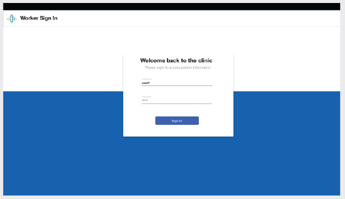
Through user testing of our wireframes, we noticed that “Sign in” caused confusion amongst our users as individuals were unsure if a patient was being signed in or a worker. Therefore, it was crucial that we carefully separate the two processes. As a result, we used the words “Check-in” and “New Patient Sign Up”.
Patient Profile section
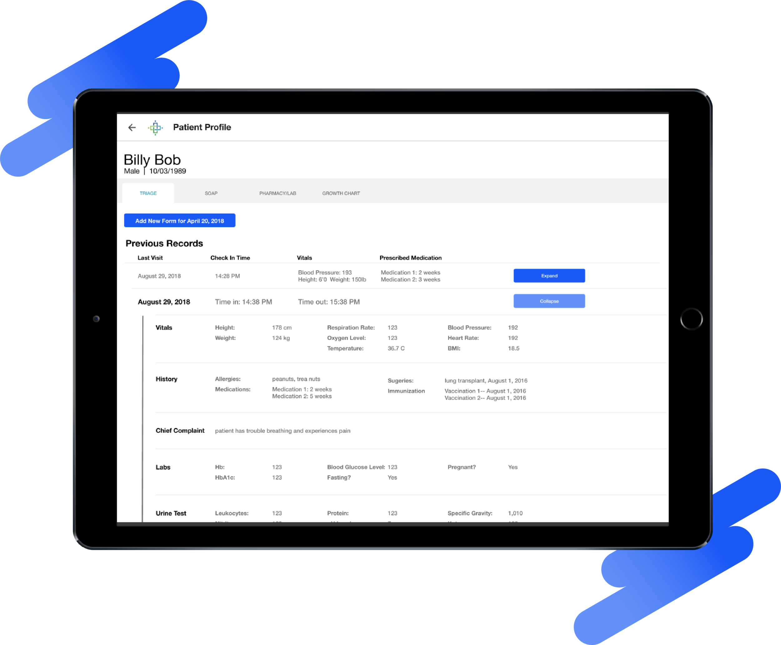
Our team broke it down so that there are four tabs for the different stations that the patient would go to. In the triage page, the patient's previous records are displayed in rows. Each row can be clicked to expand or collapse for doctors to easily access information from older visits. Tremendously more efficient that digging through a pile of papers.
Pharmacy section
In the Pharmacy/Lab tab, clinic workers can easily see the patient’s current medications, past prescriptions, and lab orders. Placing new prescriptions and lab orders are simplified now that everything is digital, and the pharmacy and lab stations can receive new requests through the app instead of passing paper around the clinic.
Lab Queue (left) and Pharmacy Queue (right)
Both the lab and pharmacy queue is directly accessible from the home page. These lists are maintained automatically and update whenever a new request from the patient profile comes in. Workers can easily process the requests and mark a lab or pharmacy request as complete to clear it from the queue.
Reflection & Takeaways
This year-long journey was an amazing experience because my diverse team and I followed the design process from the very beginning. More importantly, it was my first time designing in the public health field and producing a product that may benefit a large community. Some of my key takeaways are:
It’s about the users: When designing a product, it’s easy to forget that you’re designing for a set of specific users. Once our creative freedom kicks in, we tend deviate from the problem and explore ideas and concepts that may be impressive but could be totally useless.
Teamwork makes the dreamwork: With over 10 designers on the team, I had a remarkable experience during the ideation and wireframing phase. We were able to bounce tons of ideas of each other and each team member provided valuable feedback from their unique backgrounds.
Continuous iteration: While we iterated on our prototype and ideas many times throughout the year, I would have loved to gain user feedback after implementation of the EMR application and work towards improving it. The special thing about the design process is that it never ends.
Team & Collaborators
Huge thanks to my talented team and our team leader Jan DeCastro. And a big shoutout to all the organization that we collaborated with that provided us the opportunity to make this project into a reality.


