AlchemyX
Designing a responsive website for a start-up incubator in San Diego
Identifying the problem
AlchemyX is a company that hopes create a collaborative community where innovative thinkers come together to create exciting projects. Their confusing brand identity conveyed through a poorly researched and tested website was a recipe that needed a refresh. As a result of this, AlchemyX have restricted themselves from online marketing and advertising, leading to low customer conversions.
Solution and my role
During this project, I focused on UX design and was exposed to a variety of roles, ranging from user research, UI sketching, logo ideating, and stylescaping. Our goal was to create a representative brand identity as well as a powerful, responsive website with clear information architecture and user flow.
User Research and User Testing
Through user research and testing of the old website, we were able to identify the different use cases for the site as well as how AlchemyX stands on a branding perspective to its audience.
Individuals looking for work experience
College students with lacking experience motivated to learn new skills
Young experts with a few years of experience in their respective fields
Individuals with startups and startup ideas
Curious individuals hoping to make their idea a reality. Looking for reliable and trustworthy mentors for guidance
Motivated people with growing startups looking for expertise and a source of funding
Individuals looking to invest in a startup
Angel Investors on Angellist.com
Personal investors looking to capitalize on an innovative startup
Common Trends
Lack of focus on AlchemyX’s team and their prior experiences
- How can we highlight the company’s experiences in a way that appeals to startup founders?
Finding specific information about startups such as job openings, person to contact, etc. was lacking
- How can we create a fluid work flow with simple IA which focuses on detailed information about AlchemyX’s startups?
Generic content detracted individuals
- How can we add a sense of personality and character to the company’s site?
Brand Creation
With the help of Andrew Morner, an experienced graphic designer, we began our first branding session. During this meeting, we brought together the executive team and tried to understand their vision for the company. We performed various branding exercises and gathered the team’s thoughts and impressions about AlchemyX and categorized them.
We then, as a team, collected our thoughts and produced two style guides and pitched it to the executive team. From here we iterated on our style guides and Andrew created a final stylescape and a logo that represents AlchemyX’s values.
Sitemap + UI Sketches
With the refreshed brand formed, we began to ideate on a sitemap for the most efficient user flow. Keeping in mind the content that is going to be presented, we iterated on the experience map various times.
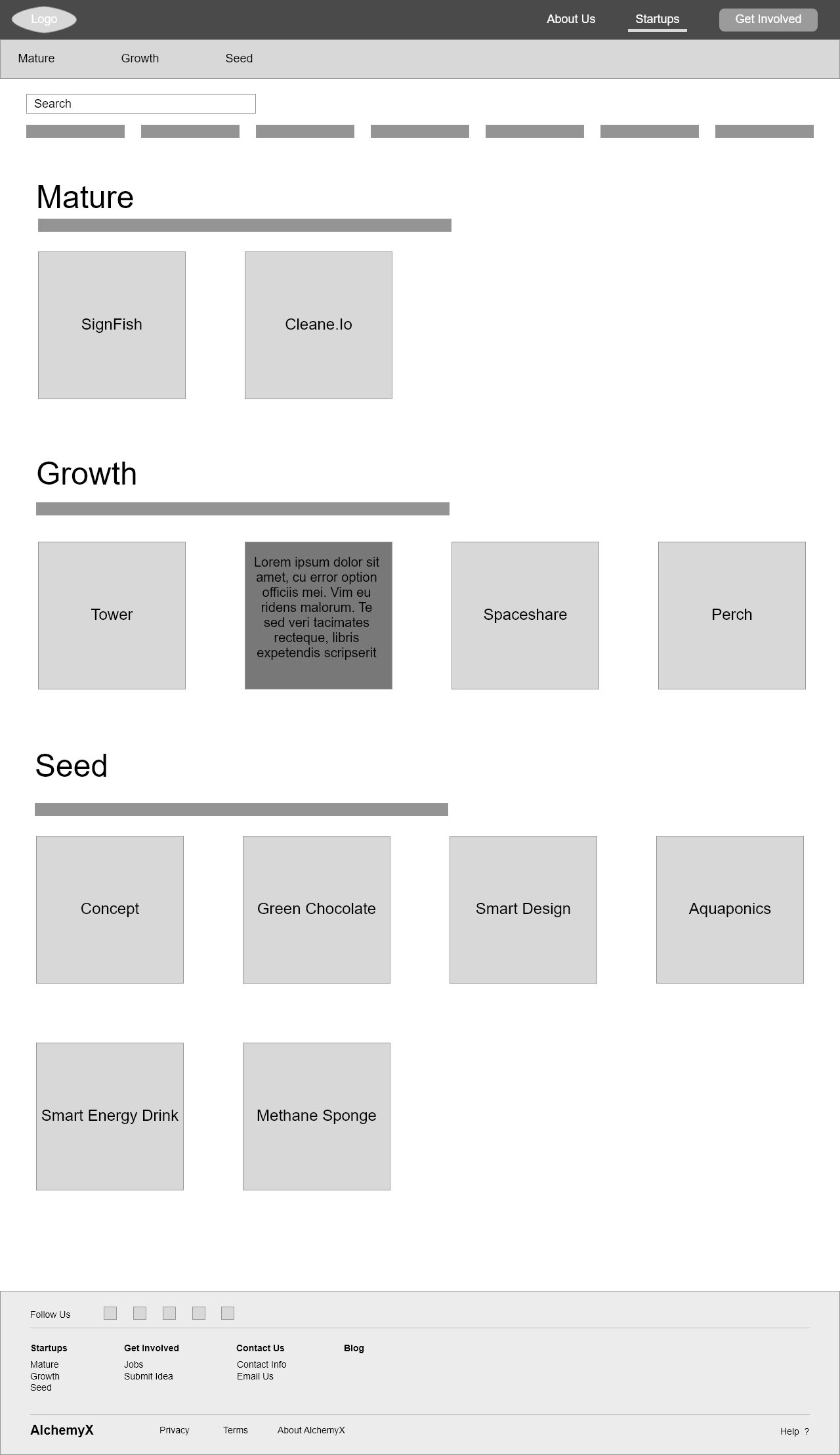
Soon after, we began to create low-fidelity UI sketches and medium-fidelity prototypes. We explored various potential solutions to see exactly how we could represent a startup incubator as a transparent, trustworthy, and experienced brand. Our goal was to present information about the team and the company while maintaining a fluid flow where users can effortlessly browse through AlchemyX’s startups.
Feel free to look through the sketches and our phase one wires here
Design Decisions and Tradeoffs
In general, we learned that:
⅘ users successfully submitted their pseudo application for a UI designer
All users submitted an idea successfully or with little error
3 users had confusion as to what AlchemyX is
With a growing company like AlchemyX, we knew every design decision was important. Through multiple meetings we debated and discussed whether to include a roadmap, where to place the company’s values, structuring the hierarchy of CTA buttons, and much more.
Specifically, including a visual roadmap would show transparency between the business-consumer interaction but for a developing company like AlchemyX, flexibility in their goals are key. Additionally, we decided to include a separate web page for each startup. While this may be very time-consuming, each startup will have its own identity and this will present AlchemyX as a more structured and reliable company.
Finally, appropriately structuring CTA buttons are vital for fluidity in flow and ultimately, guiding the user to collaborate with AlchemyX.
Wireframes and User Flow
Once we identified common trends amongst users and made crucial design decisions, we iterated on our prototypes and moved to the next stage of building a more comprehensive experience.
We created interactive wireframes and completed a final round of testing to highlight any issues that the designs might have.
High-fidelity Mockups
Through iteration and continuous testing, we came up with high-fidelity mockups. These were created with the help of Andrew Morner and phase one of the website is live now. Because of the nature of the design process, the website will be continuously iterated upon through feedback and testing.
Reflection & Takeaways
This was an exciting project where I was able to work with a diverse set of team members, practice, and learn a lot of design skills. Some of my key takeaways from this project are:
1. Validation! Validation! Validation! — During this case study, I was able to realize the importance of validating my designs. Every interaction, every box, every link should be supported with justification and should serve a crucial purpose.
2. Keep the tests coming — Often, designers are unaware of assumptions and issues that might exist in their designs. User testing helped us identify such issues and once we iterated, different concerns rose. Performing as many rounds of testing as possible is key to creating an effective experience and meeting the user’s needs.
Special thanks to my design team: Steven Chen, Tammy Zhou, Yuka Okina, Joey Wong, and Andrew Morner!


